

USE CURRENT COLORS
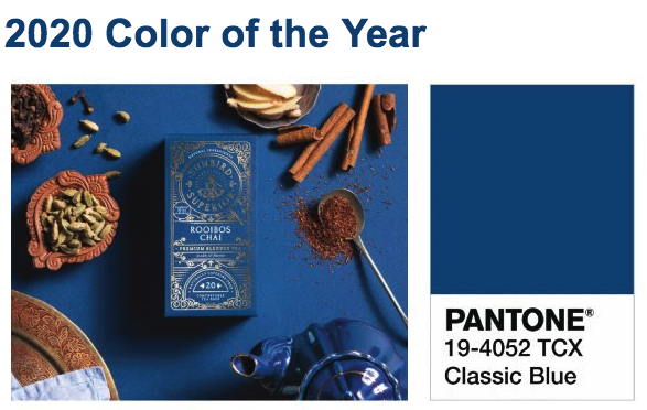
This years color is “Classic Blue”, “Instilling calm, confidence, and connection, this enduring blue hue highlights our desire for a dependable and stable foundation on which to build as we cross the threshold into a new era.” (pantone.com)
USE WHITE SPACE WELL
The main thing is the main thing. It’s super clear and easy to read.
The days of including every bit of info on your graphics are behind you. Use the design on more than just Instagram…add it to a hand out and put the info on the back.
KNOW YOUR FONT
Know your font, and choose wisely. Never use more than 3 fonts on any one piece. Pay attention to how easy the font is to read, and what the style communicates if you couldn’t read the words.
P.S. If you’re curious about what font someone else is using, these are great tools for discovery: https://www.fontsquirrel.com/matcherator https://www.whatfontis.com/
Consider these two designs from Life.Church.
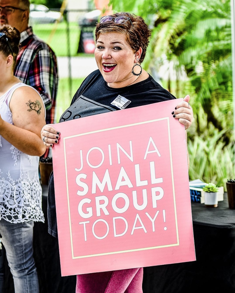
EXAMPLE The yellow and pink on this Handheld Sign from the Action Church utilizes a pale yellow square against a bright pink background.
The contrast is not only appealing, but creates a clear definition for the white words in the center of the sign.
BE CONSISTENT
Whatever your look, your feel, your vibe, keep it. It’s tempting to jump on catchy trends that appeal to you, but try to stay in line with your brand guidelines. Strong brands are able to be recognized without having to explicit state who created it.
For example: You can recognize a Target commercial before you see their logo by the bright pops of color and solid backgrounds. You connect sharp, clean images with Apple.
Know your audience and develop your brand. Consistent branding not only creates valuable “brand recognition”, but clarifies your message and connects you with your audience.